Color schemes give your theme additional color palettes. With just a small amount of changes to your theme’s CSS, you can subtly change the look of your theme, while maintaining the same design and feel to it.
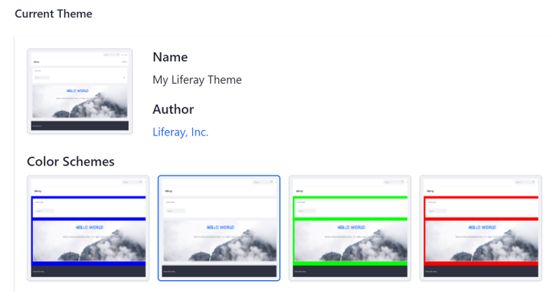
Figure 1: Color schemes give administrators some choices for your theme's look.
Follow these steps to create color schemes for your theme:
-
Open the theme’s
WEB-INF/liferay-look-and-feel.xmlfile and follow the pattern below to add the default color scheme. If your default styles are in_custom.scss, use thedefault<css-class>as shown in the example below. See the liferay-look-and-feel DTD for an explanation of each of the elements used below:<theme id="my-theme-id" name="My Theme Name"> <color-scheme id="01" name="My Default Color Scheme Name"> <default-cs>true</default-cs> <css-class>default</css-class> <color-scheme-images-path> ${images-path}/my_color_schemes_folder_name/${css-class} </color-scheme-images-path> </color-scheme> ... </theme> -
Add the remaining color schemes below the default color scheme, using the pattern below. Note that the IDs, names, and CSS classes must be unique for each color scheme.
<color-scheme id="id-number" name="Color Scheme Name">
   <css-class>color-scheme-css-class</css-class>
</color-scheme>
An example
liferay-look-and-feel.xmlconfiguration is shown below:<look-and-feel> <compatibility> <version>7.2.0+</version> </compatibility> <theme id="my-great-theme" name="My Great Theme"> <template-extension>ftl</template-extension> <color-scheme id="01" name="Default"> <default-cs>true</default-cs> <css-class>default</css-class> <color-scheme-images-path> ${images-path}/color_schemes/${css-class} </color-scheme-images-path> </color-scheme> <color-scheme id="02" name="Dark"> <css-class>dark</css-class> </color-scheme> <color-scheme id="03" name="Light"> <css-class>light</css-class> </color-scheme> <portlet-decorator ...> ... </theme> </look-and-feel> -
Create a folder for your color schemes (
color_schemesfor example) in the theme’scssfolder, and add a.scssfile to it for each color scheme your theme supports, excluding the default color scheme since those styles are included in_custom.scss. -
The color scheme class is added to the theme’s
<body>element when the color scheme is applied, so add the class to the color scheme’s styles to target the proper color scheme. The example below specifies styles for a color scheme with the classday:body.day { background-color: #DDF; } .day a { color: #66A; } -
Import the color scheme
.scssfiles into the theme’s_custom.scssfile. The example below imports_day.scssand_night.scssfiles:@import "color_schemes/day"; @import "color_schemes/night"; -
Create a folder for each color scheme in your theme’s
imagesfolder, and add a thumbnail preview for them. The folder name must match the color scheme’s CSS class name.
There you have it. Now you can go color scheme crazy with your themes!